Today I am sharing this fun and sparkly cards featuring Floral Burst Digital stamp release by Rachel Vass.
I have made two cards using this latest release called Floral Burst.
The First Card
Here is my first card.
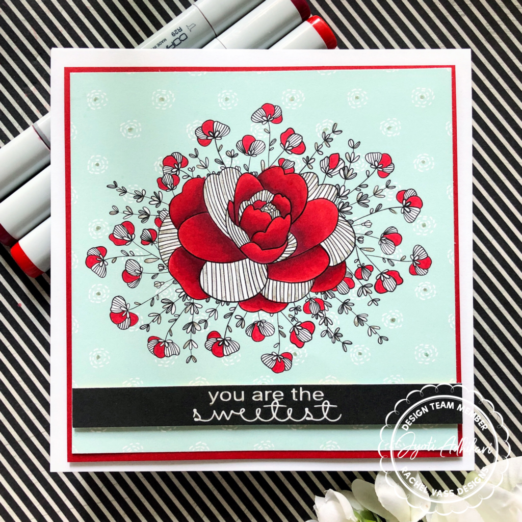
We’re used to making the standard A2 size cards and lately the slimline size is getting so popular. Since this image was somewhat more square I wanted to create a 6 by 6 card with it.
The Technique
Like my previous card I used the digital background for this card too. I really loved this pastel green background for my card. Rachel’s images has white fill to them so it’s nice to print over the digital pattern paper and still have some white space inside the image for coloring.
One of these days I will learn how to color the image digitally. I do not have softwares like Photoshop or Adobe Illustrator. I use my Sillhoutte cameo software to design my digital images and print them.
The Focus
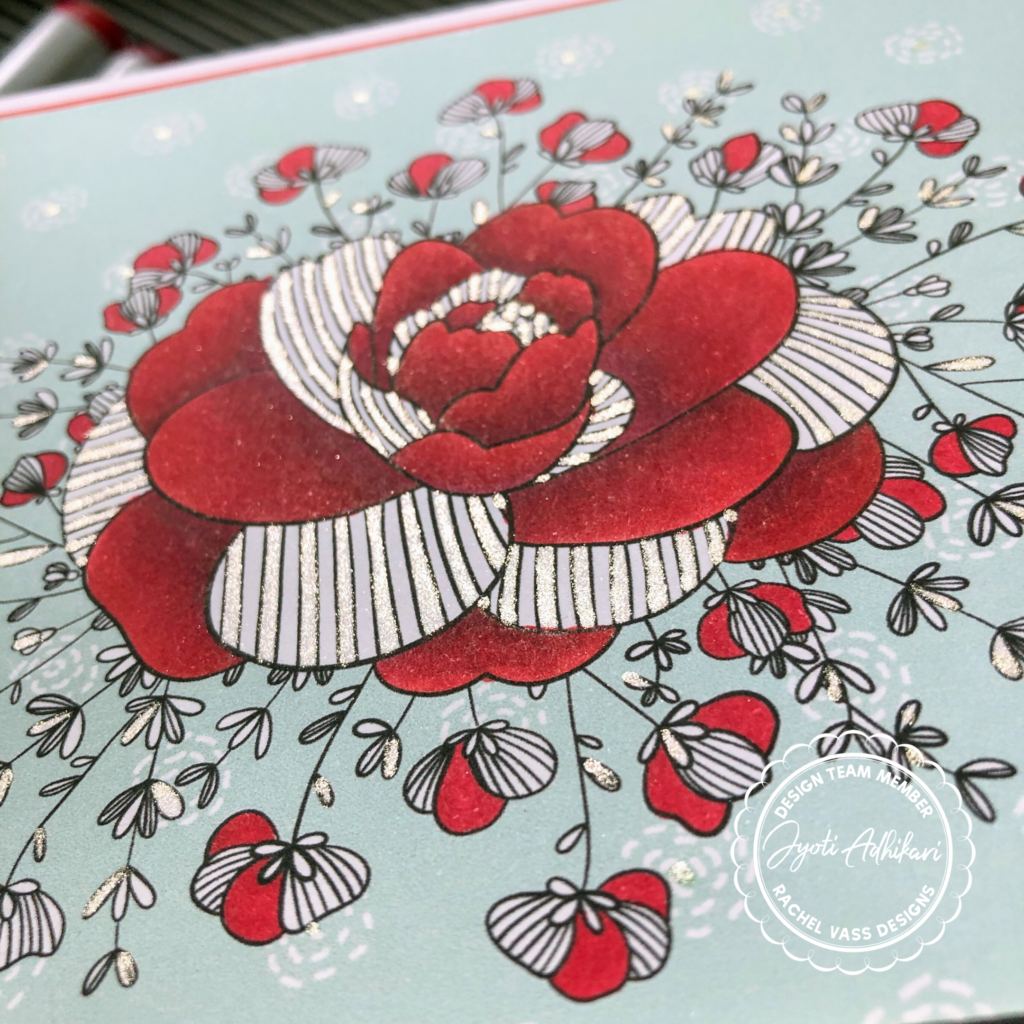
After I printed the floral image along with the background, all I had left was to color the image. I chose Copic Color for my image. Reds I thought would compliment the pastel green background. The images don’t really show the true color of the background.
The flowers were colored with R24, R37, and R39. These colors blend so well. That’s my favorite red combination. I only colored the open spaces on the flowers with Copics, because I had this sparkly idea in my head.
The Accent
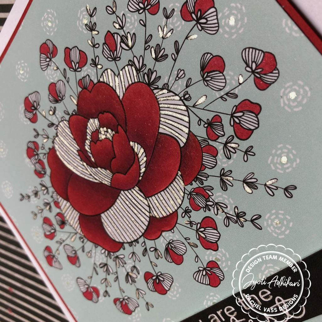
This picture may not be very good, but I wanted to capture the sparkle. Hope you can see them. I drew lines with a sparkly gel pen and filled some of the leaves with the sparkly pen too.
Then I cut this panel and matted with a red card-stock that matched with my Copic coloring perfectly. Then added that one a 6 by 6 top folding card base using foam tapes.
The Sentiment
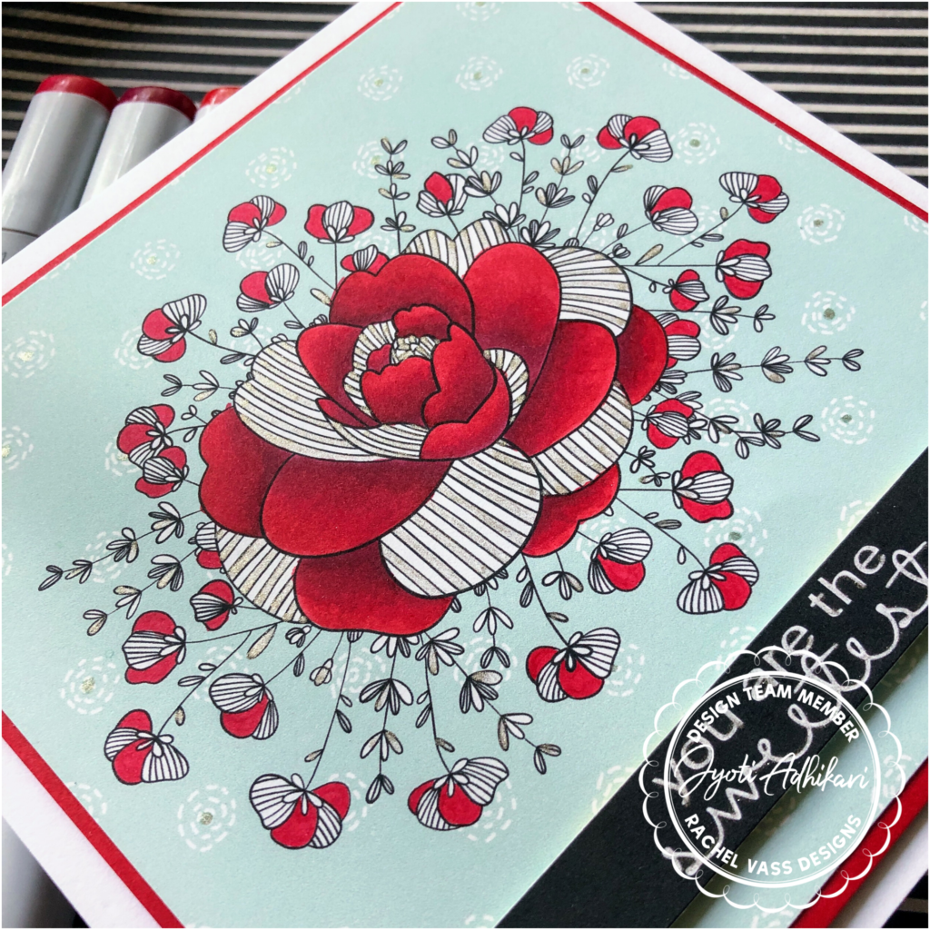
I printed the sentiment that came with the Floral Burst stamp set. If you guys know how to do the reverse color with the sentiment, I did white on black. All I did was traced the sentiment, and changed the color of the sentiment to white then created a black background around it and printed. I love the look of the white on black sentiment better than black on white. The sentiment is cut in a strip and adhered with another layer of foam tape behind it.
The Second Card
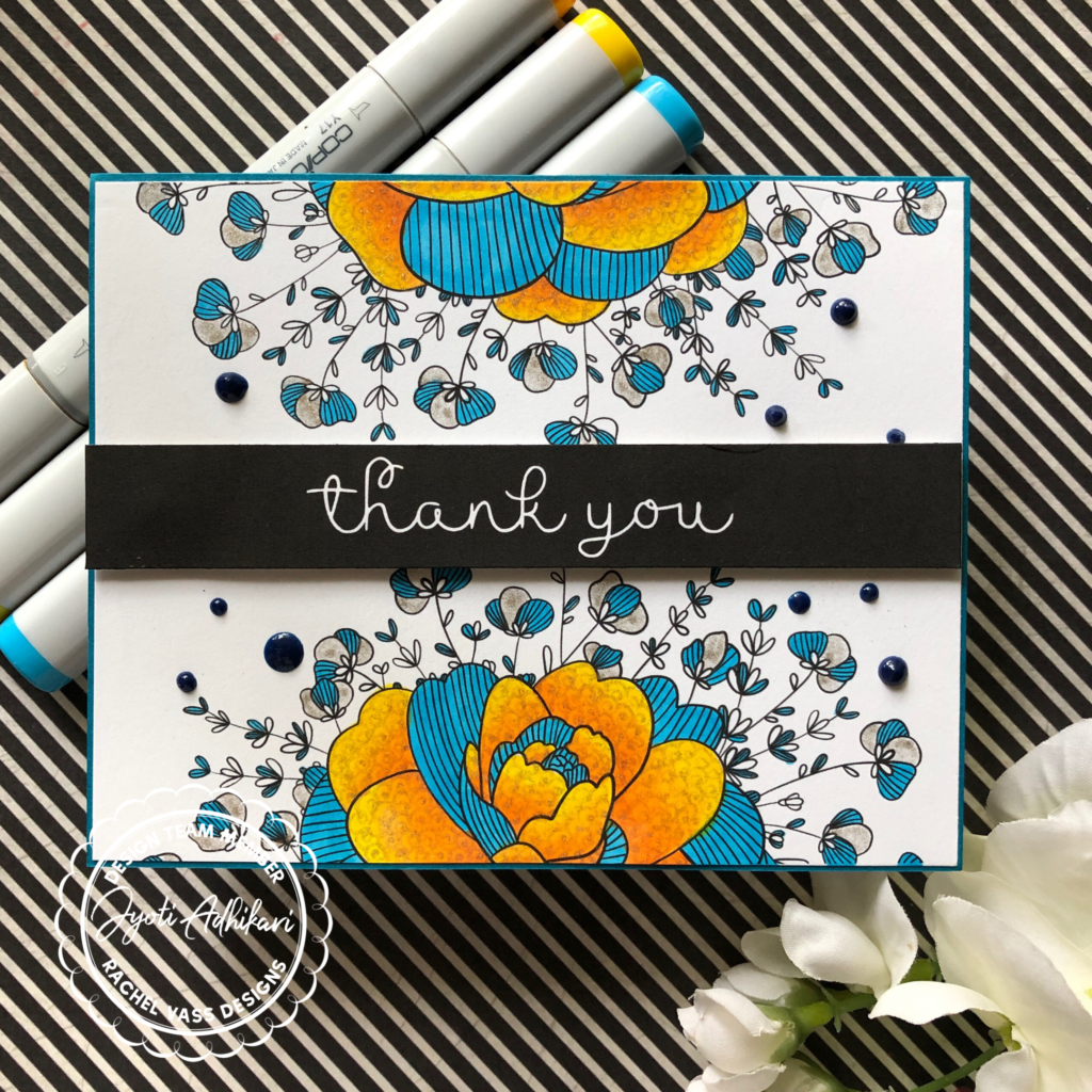
This one I created an A2 card but with the split image. Looks like I printed one image and cut it in half. But in fact I printed it that way. I left the background plain this time.
The Focus
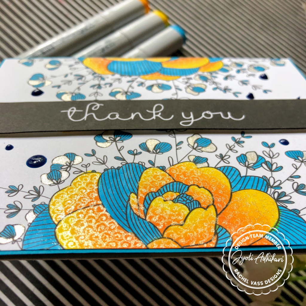
For this one I colored in two colors. Yellow and blue has been one of my favorite combo.The open petals I colored in shades of yellow but the lined petals was only one shade of blue.
I used Y08, YR12, Y17 and YR15. I know it sounds like a weird combination but it gave me the look that I was going for. The blue I used is B04.
The Accent
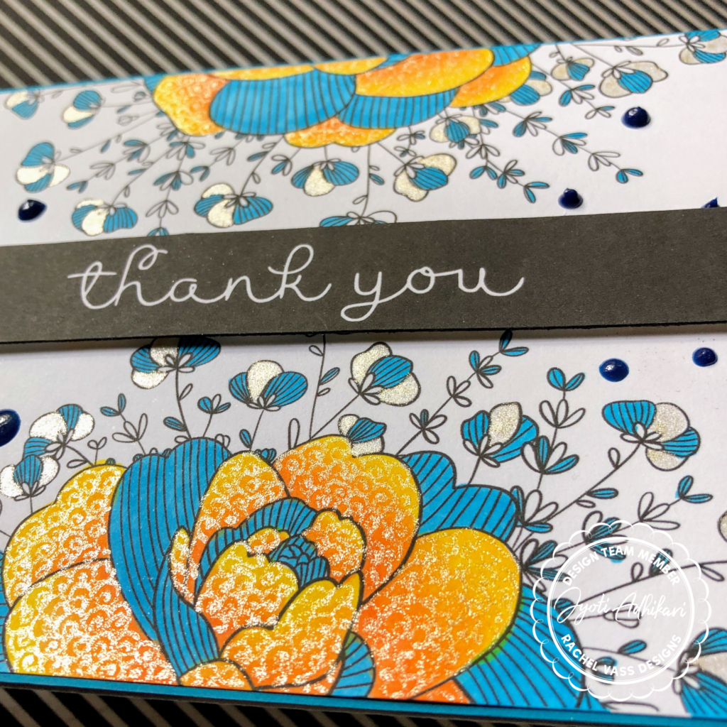
I colored the open spaces in the smaller flowers with the sparkly gel pen. The yellow petals were a little too big to just fill with the gel pen so I doodled some swirly circles on them to fill the space. I loved how this one turned out.
In fact this is my favorite among these two cards.
The Sentiment
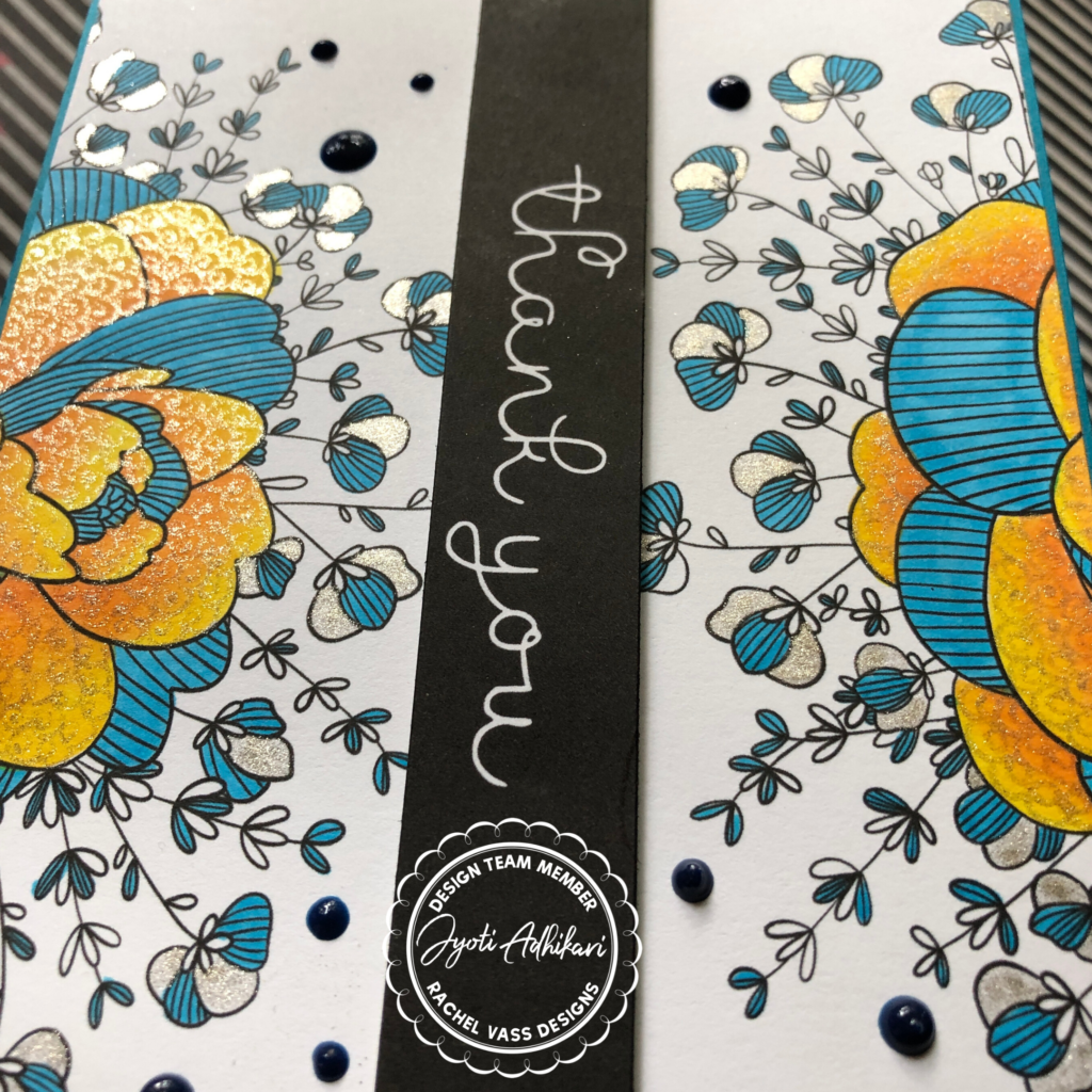
Again for this card too I created the white on black thank you sentiment and cut that in a strip and adhered with foam tape.
I then matted this panel on a slightly bigger blue card-stock panel that matched with my coloring to make a 4 and a quarter by 5 and a half card front. This was added on a A2 size card-base using foam tape.
Finally added some blue Nuvo Jewel Drops to fill the empty white space and complete the card.
I hope this inspires you to use whatever you have in your stash to create this fun sparkly effect on your card.
Hugs
Jyoti