When you say Monochromatic, first thing that pops in my head is just one color and pretty boring. But most certainly, that is not true. Even if, you use just one color you can use different values of the same color to create highlights and shadows. Let’s not talk about the whole artistic expertise here as I am not one.
Hello Everyone!
We at the The Flower Challenge blog are starting off this new year with a new theme for January 2022. Our theme this month is “MONOCHROME”
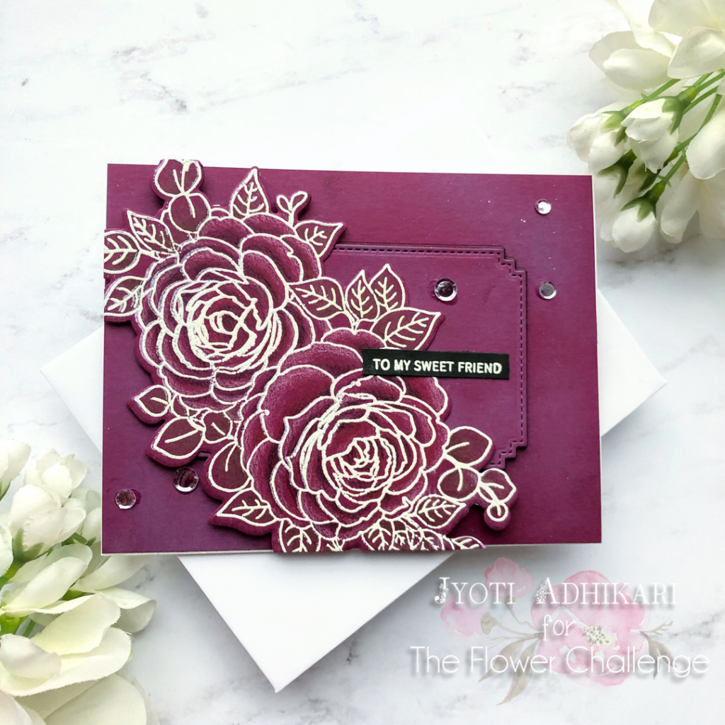
Here is my take on it.
Focus
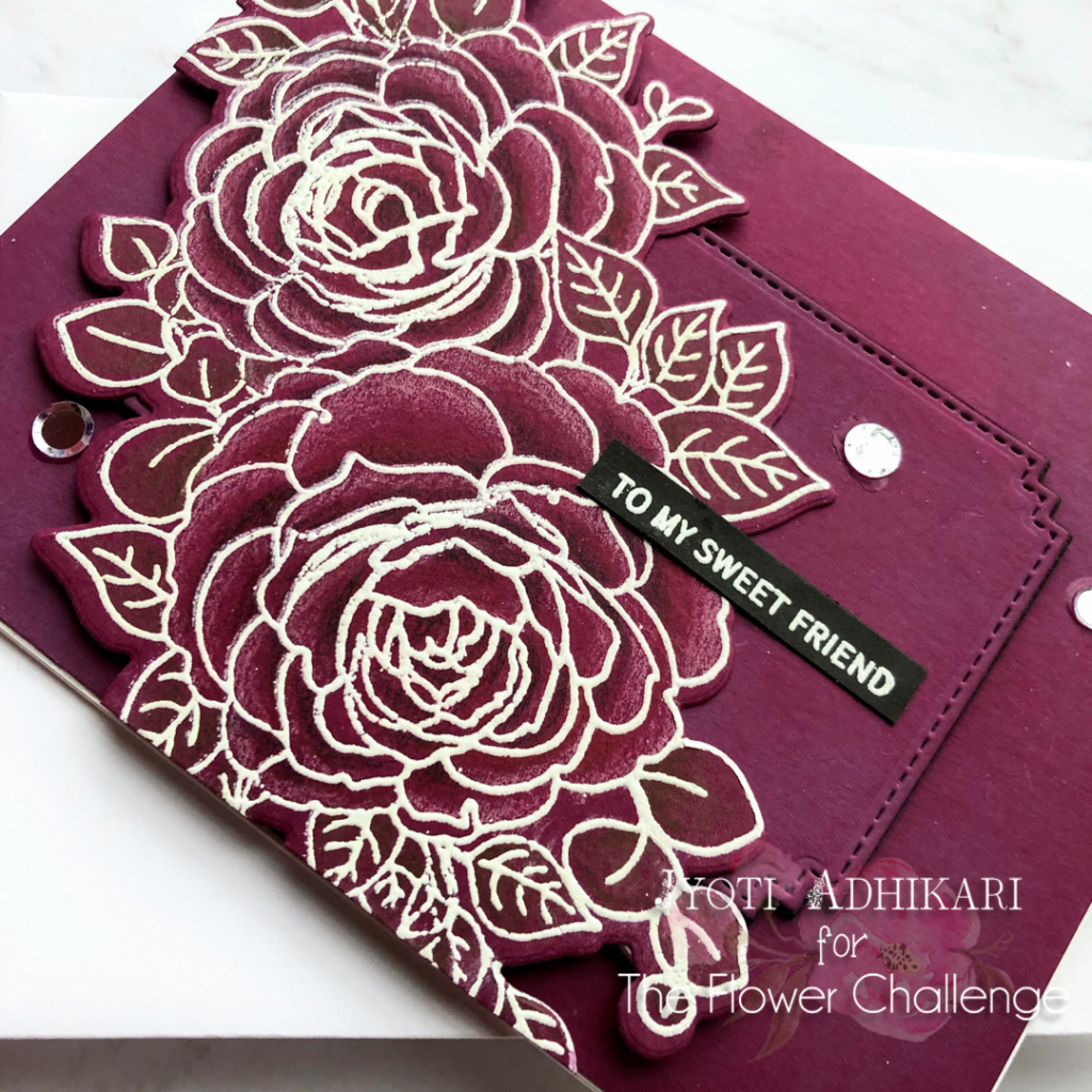
Started off by stamping the beautiful floral image by Gina K Designs called Grateful Blooms with Hero arts Unicorn white pigment ink. But of course,I did have to heat set the ink before I started coloring as this ink dries slow.
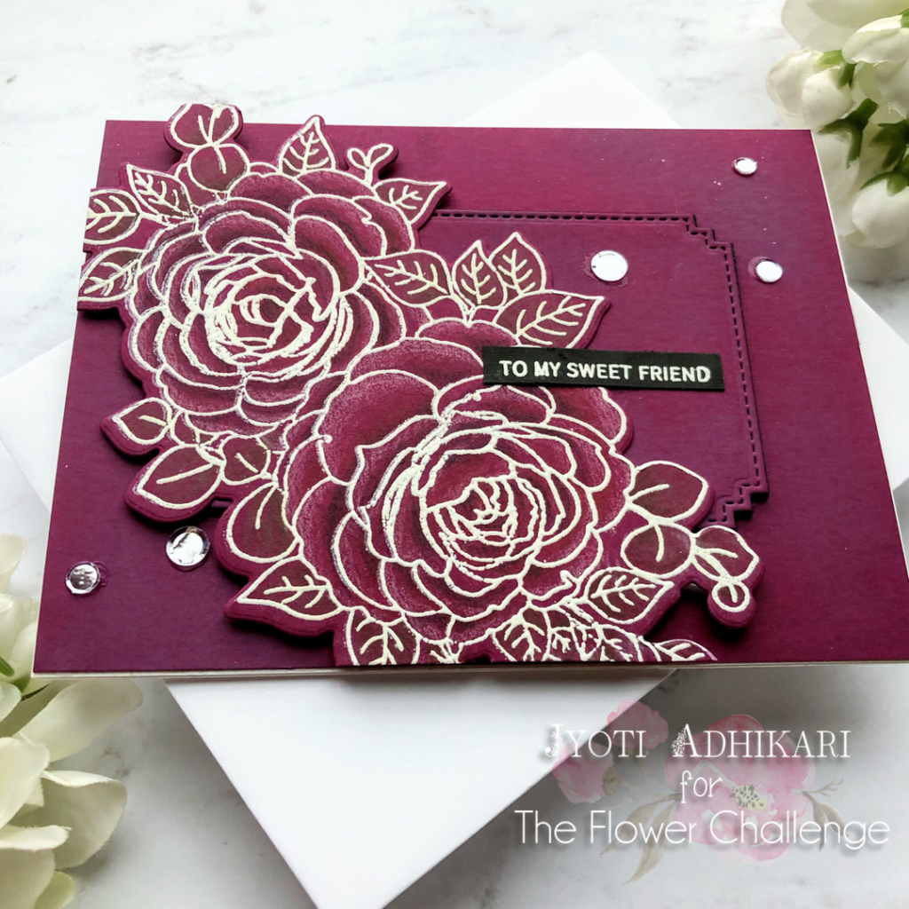
I used Prismacolor pencils to color this beautiful image. After my image was colored in a slight definition of highlights and shadows I used the coordinating die to cut the image out.

Background
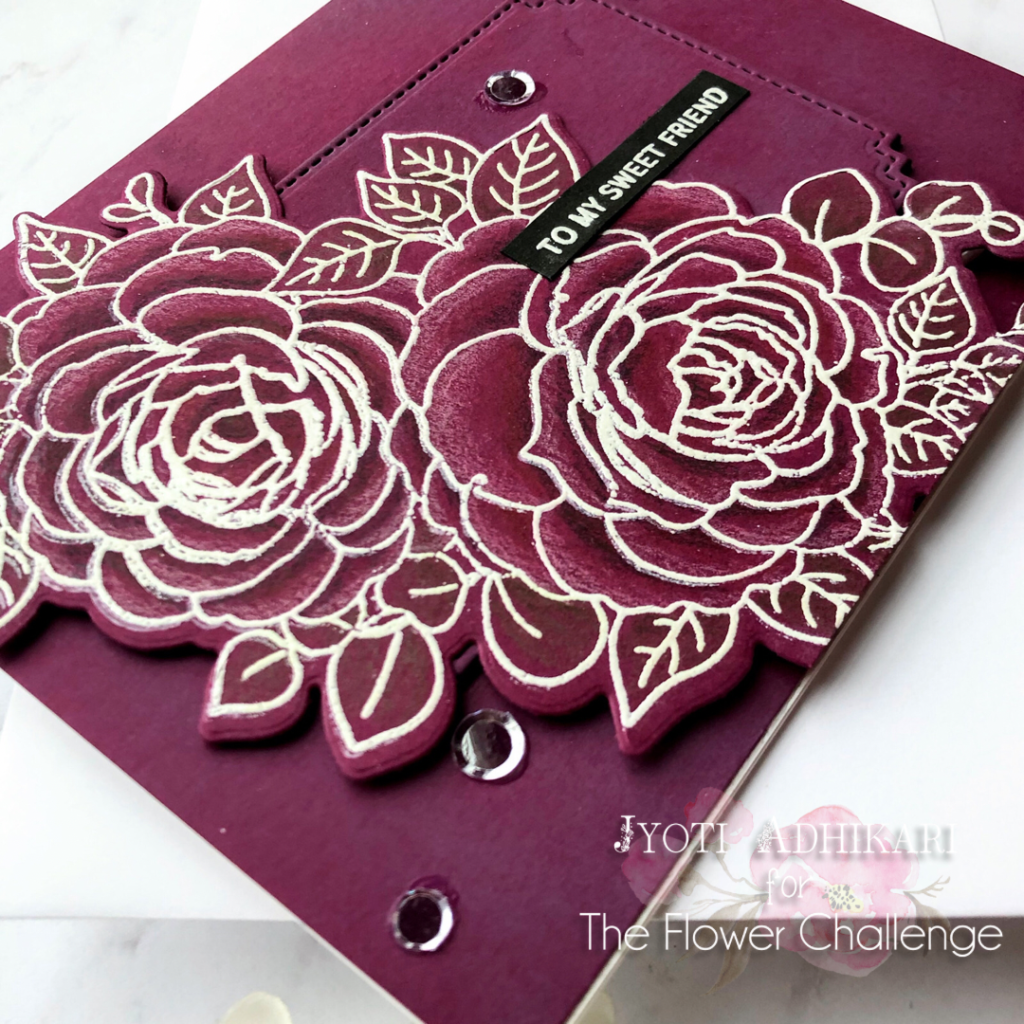
For the background of my card I used the same Hero Arts Plum card-stock piece that was cut to 4 and a quarter inches by 5 and a half inches. I used Memory Box Matinee Rectangle die to cut out the middle portion of the panel and popped it up with foam at the back.

Sentiment
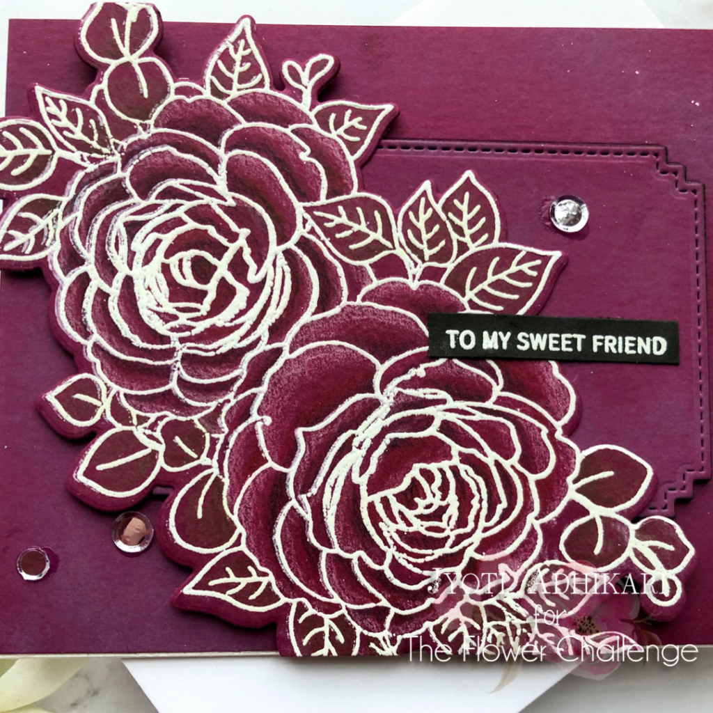
The sentiment is from Ton Stamps. Usually, I keep sentiment strips already stamped and embossed and cut to go on a card in an organizer, so I don’t have to spend time picking out the sentiments for my card.
Embelishment
Finally, I added some clear sequins with liquid glue, cut off the overhanging pieces of the image with a pair of scissors and called it done.
If you are interested, I have created a short video while I was creating this card. Enjoy!!
Hope you get inspired by my card today and if you create your monochromatic card don’t forget to share at The Flower Challenge.
For some other cards I have created for the challenges. Click here.
Hugs
Jyoti
The cardstock in plum is so gorgeous! I love it! Beautiful shading in the flowers!!!
Thank you so much TaEYun for your kind comments.❤️
Stunning card and colour Jyoti, love all the detail too 😉 hugs Viv xx
Thank you so much Vivien.
I love the rich dark color, Jyoti. The pencil shading was a great idea to give the flowers some depth.
Thank you so much Bobby
Jyoti, those were my very same thoughts! You found a way to make this gorgeous plum color work beautifully by deepening the color in the shadows!
=]
Thank you so much for the kind comment Michelle.